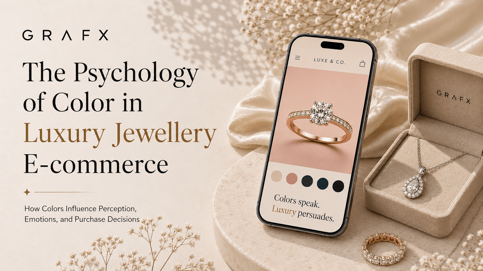
Buying fine jewelry is rarely a purely logical decision; it is a highly emotional one. Whether a customer is purchasing an engagement ring, celebrating a milestone, or indulging in self-reward, their purchasing behavior is heavily influenced by subconscious psychological triggers.
One of the most powerful triggers is color. Within milliseconds of landing on your e-commerce product page, a customer’s brain processes your brand's color palette and makes a snap judgment about your jewelry's price, quality, and exclusivity. Here is how you can strategically use color psychology to elevate your brand and increase online sales.
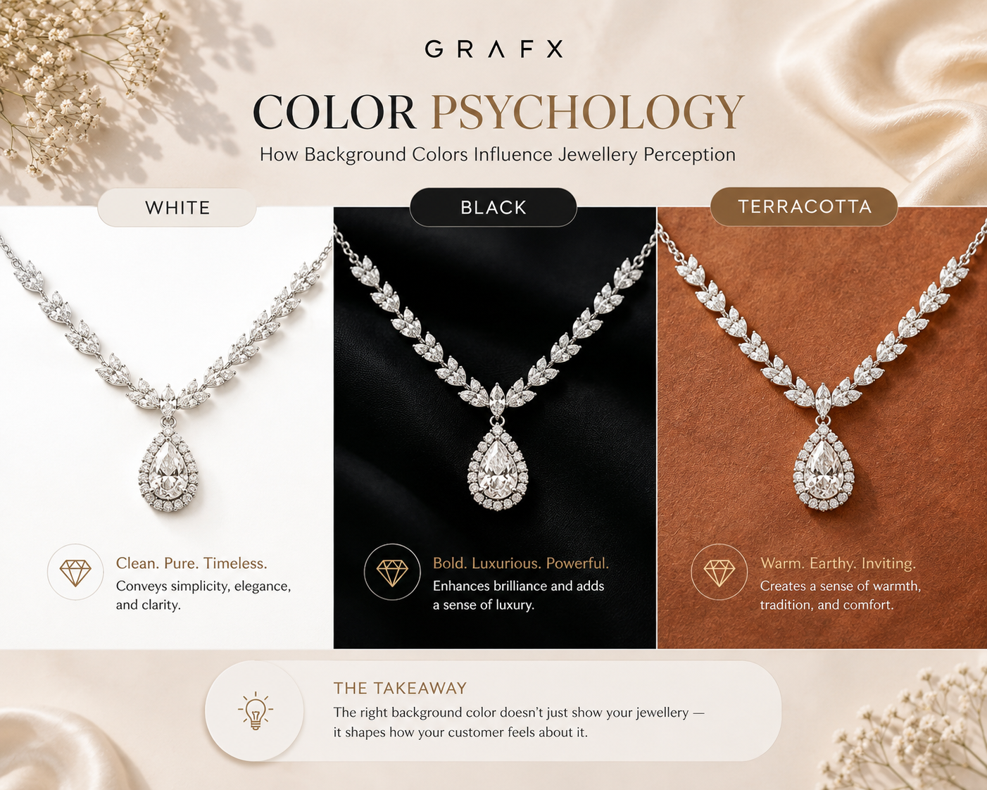
1. Black: The Color of Exclusivity and Power
There is a reason legacy luxury brands often use heavy black accents and dark product backgrounds. In color psychology, black represents power, sophistication, and mystery.
- High-Contrast Drama: Black creates the highest possible contrast for diamonds and bright metals, making them appear to glow from within.
- Perceived Value: Products displayed on dark, moody backgrounds are automatically perceived as more expensive and exclusive. If you are selling high-ticket, one-of-a-kind pieces, deep black or charcoal gray communicates uncompromising luxury.
2. White: Purity, Clarity, and Trust
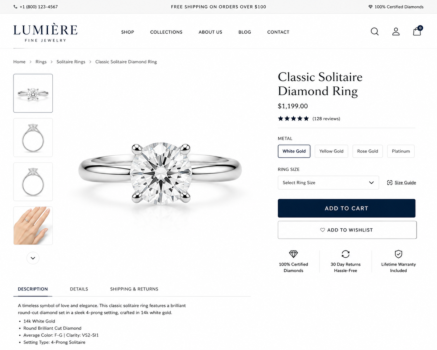
Pure white is the undisputed king of modern e-commerce. Psychologically, white is associated with purity, transparency, and cleanliness.
- Analytical Buying: When customers are spending thousands of dollars online, they want transparency. A crisp white background tells the brain there is nothing to hide, allowing the buyer to analytically inspect the clarity of a gemstone and the precision of the setting.
- Modern Minimalism: White creates a sleek, minimalist aesthetic that feels modern and highly organized, reducing cognitive load for the shopper.
3. Warm Earth Tones: Approachable, Everyday Luxury
Over the last few years, warm neutrals—such as beige, terracotta, muted peach, and warm sand—have dominated the direct-to-consumer jewelry market.
- The Human Element: Warm tones mimic the colors of human skin and nature. They make jewelry feel wearable, accessible, and grounded.
- Targeting Gen Z and Millennials: Younger demographics often associate stark black with "stuffy" traditional luxury. Earth tones signal a brand that is modern, sustainable, and focused on everyday, effortless elegance.
4. The Power of "Action" Colors: Blue and Gold
Your product backgrounds are not the only colors that matter. The accents on your website—specifically your trust badges and call-to-action (CTA) buttons—play a massive role in conversion rates.
- Blue for Trust: Blue is universally recognized as the color of security, stability, and trust. Using deep blue for your checkout buttons or warranty icons helps alleviate the anxiety associated with making a large online purchase.
- Gold for Wealth: Subtle gold accents in your typography or branding evoke feelings of prosperity and high quality, subtly reinforcing the value of the precious metals you are selling.
Final Thoughts
Color is a strategic tool that speaks directly to your customer's subconscious. By aligning your visual palette with your brand identity—whether that is the exclusive power of black, the trustworthy transparency of white, or the approachable warmth of earth tones—you can guide your customers' emotional state and confidently drive them toward the checkout.
Test Winning Background Colors Instantly with AI.
Want to see if your audience converts better with moody blacks, crisp whites, or warm earth tones? Don't reshoot your entire catalog. Grafx is an AI photography platform built specifically for jewelry brands. Generate hyper-realistic imagery in limitless color palettes and environments in seconds.