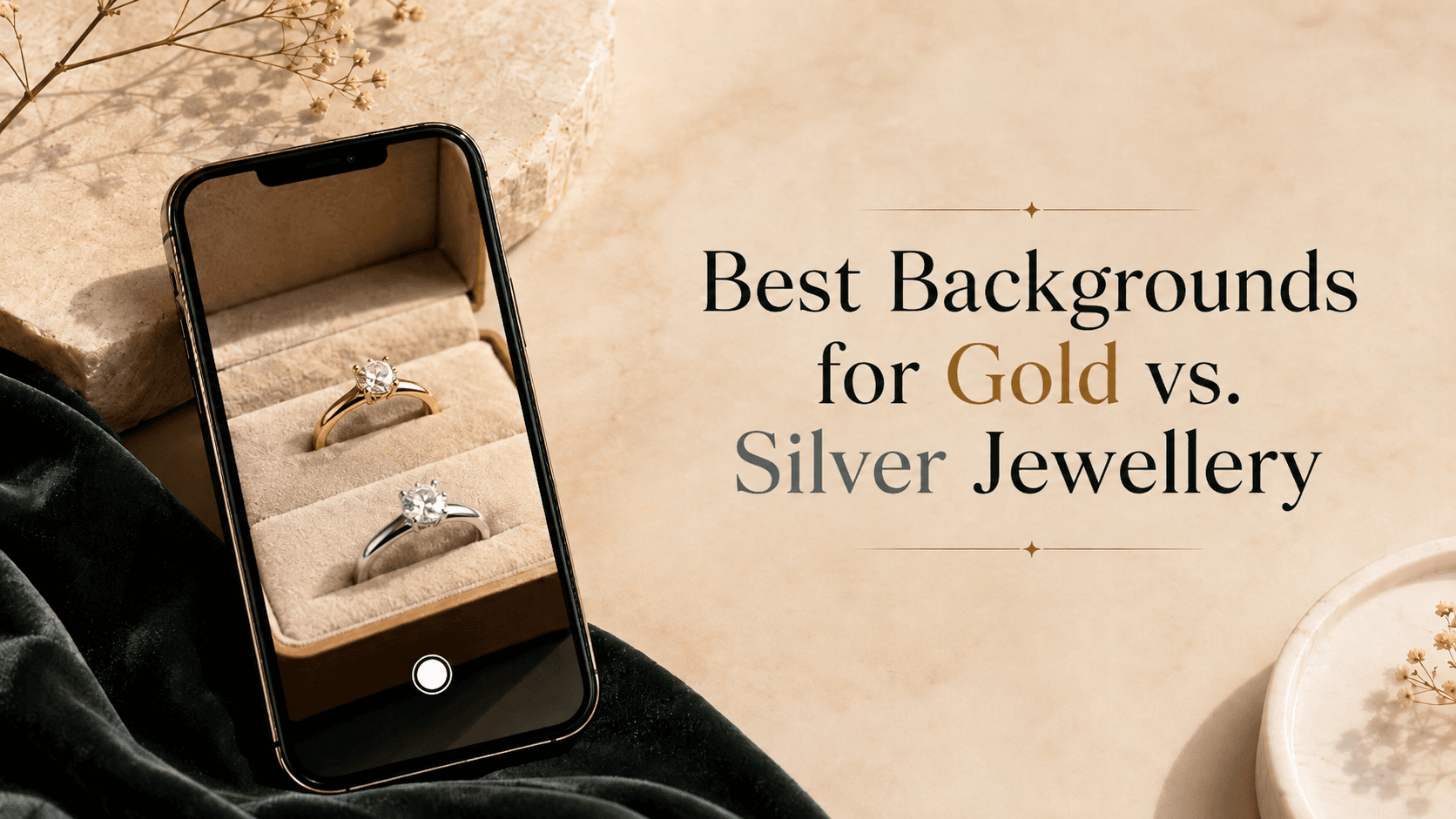
In jewelry photography, the background does much more than just fill the empty space behind your subject. Because highly polished metals act like curved mirrors, they reflect their immediate surroundings. If you choose the wrong background color, your stunning gold necklace might look brassy, or your silver ring might look dull and gray.
Understanding color theory and how light interacts with different metals is the key to creating scroll-stopping product imagery. Whether you are shooting for a luxury editorial or an e-commerce catalog, here is your guide to choosing the best backgrounds for gold and silver jewelry.
1. Best Backgrounds for Gold Jewellery
Yellow gold is naturally warm, rich, and luxurious. To make gold jewelry truly pop, you want to use backgrounds that either complement its warmth or provide a striking contrast.
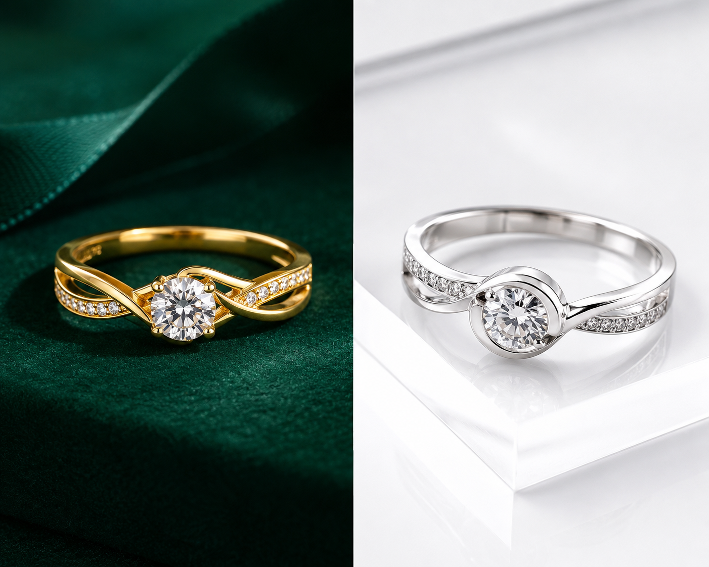
- Deep, Moody Greens (Emerald & Forest): Green and yellow/gold sit in a beautiful harmony on the color wheel. A dark emerald green background provides a regal, luxurious feel while making the bright yellow tones of the gold jump off the screen.
- Classic Black: Black is a staple for luxury jewelry. A glossy or matte black background creates high contrast, making the golden highlights glow intensely. Just be careful with lighting to ensure the black doesn't reflect too heavily onto the metal's surface.
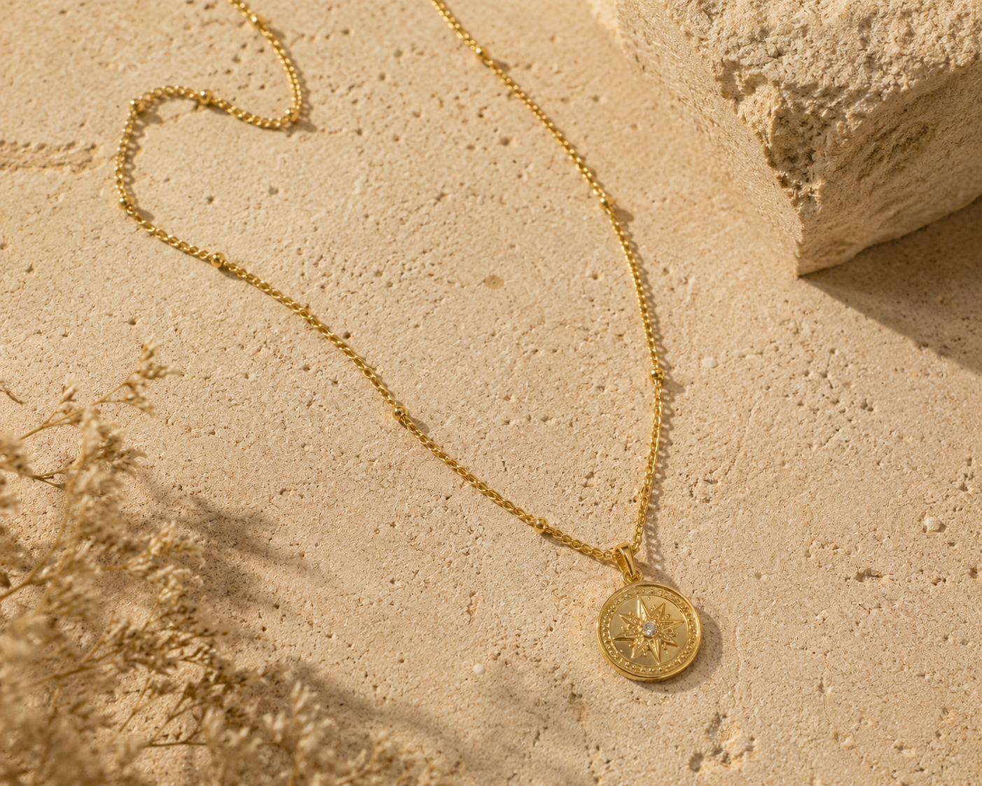
- Warm Earth Tones: Soft beige, terracotta, and warm sand colors create a modern, minimalist aesthetic. These monochromatic, analogous color schemes are highly trendy for lifestyle jewelry brands.
- Contrasting Blues: For a vibrant, editorial look, navy blue or even a muted slate blue offers a direct complementary contrast to gold, making it look incredibly vivid.
2. Best Backgrounds for Silver, Platinum & White Gold
Silver and white metals are cool-toned and highly reflective. Unlike gold, which carries its own strong color, silver tends to absorb the color of whatever is around it. The goal here is to maintain its crisp, icy brilliance.
- Pure White & Light Grays: This is the e-commerce standard for a reason. White and light gray backgrounds keep silver looking pure, clean, and bright. Using a glossy white acrylic surface can also add a beautiful, subtle reflection beneath the piece.
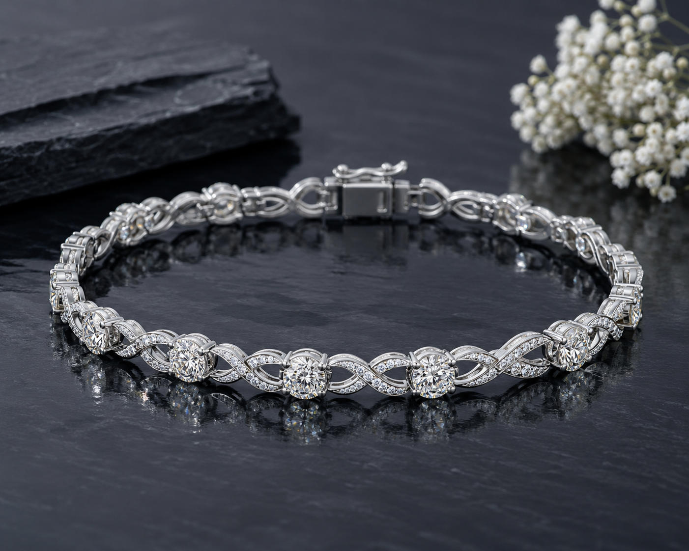
- Cool Charcoal & Slate: If you want a darker, moodier vibe without the harshness of pure black, dark charcoal gray is perfect. It provides enough contrast to make the silver stand out while keeping the overall color palette cool and unified.
- Icy Pastels: Soft, cool-toned pastels like mint green, ice blue, or pale lavender work beautifully for silver jewelry, especially for spring collections or bridal campaigns.
Pro Tip: Avoid warm backgrounds like yellow, orange, or brown when shooting silver. These colors will reflect onto the metal, making your beautiful silver piece look tarnished or cheap.
3. Choosing the Right Texture
Color isn't the only variable; the material of your background matters immensely.
- Glossy Acrylics: Perfect for e-commerce. They create a natural mirror-like reflection under the jewelry that adds depth and a premium feel.
- Matte Paper or Seamless Backdrops: Excellent for eliminating distracting reflections and keeping the focus entirely on the jewelry piece.
- Natural Elements (Stone, Marble, Wood): Great for lifestyle shots. A slab of white marble is incredible for silver, while warm walnut wood or dark slate pairs beautifully with gold.
Final Thoughts
Your background sets the stage for your jewelry. By matching the warm tones of gold with rich, contrasting, or earthy colors, and pairing the cool tones of silver with crisp whites and cool grays, you can elevate your product photography from amateur to high-end luxury.
Match Perfect Backgrounds to Your Metals Instantly with AI.
Struggling with unwanted color reflections or finding the right backdrop for your gold or silver pieces? Grafx is an AI photography platform built specifically for jewelry brands. Generate hyper-realistic jewelry imagery with perfectly complementary backgrounds in seconds.